
The Bauhaus Ideal: Complete Chapter-by-Chapter Summary
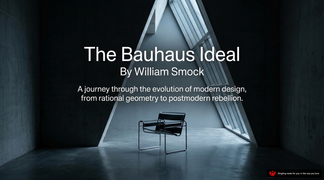
Welcome to our journey into the heart of modern design. Today, we are exploring *The Bauhaus Ideal* by William Smock.
Imagine a stark, minimalist room where light streams through a triangular opening, illuminating a single, iconic chair. This isn't just furniture; it is a manifesto. The image on your screen captures the very essence of the Bauhaus movement: a radical shift from ornate, old-world traditions to a new language of rational geometry and functional purity.
As we begin, think of the Bauhaus not just as a school, but as a bold vision for how we live. Its founder, Walter Gropius, wanted to break free from the clutter of the Victorian past. He envisioned a world where design and technology could merge to create objects that were simple, honest, and truly useful for everyone. From the clean lines of glass skyscrapers to the comfortable simplicity of a lounge chair, the Bauhaus ideal transformed the everyday world.
In this book, we will peel back the layers of this movement, starting with the brilliant teachers who shaped it. We'll look at how they believed that art shouldn't be distant or exclusive, but rather a practical tool for improving life. Their legacy is everywhere around us, proving that sometimes, the most powerful design is the one that disappears into the background, letting the function speak for itself.

Before Modernism, design wasn't about honesty; it was about disguise. Look at the left side of this slide: the Victorian living room. It's a masterpiece of clutter, draped in heavy patterns and filled with objects that signal status rather than comfort. The furniture is ornate, the walls are loud, and the sheer visual noise tells you one thing: "Look at me." It has nothing to do with how people actually live.
Now, shift your gaze to the right. This is the architectural equivalent of that clutter. Notice the label pointing to the cathedral's facade: "Symbolic Architecture." Back then, buildings were designed to look like Greek temples or French chateaus not because they served a purpose, but to project power. They were costumes. But look deeper at the "Hidden Structures" label. Behind that impressive stone facade lies a structural steel skeleton. The real engineering was hidden away, while the fake stone front took all the credit.
This era of design was an illusion. Architects and designers were busy hiding the true nature of materials and function behind layers of decoration and historical imitation. A steel skyscraper was dressed up to look like a castle; a modern office was disguised as a Gothic cathedral. It was a time when the "skeleton" of the building was concealed, and the design was purely a mask. This deceptive approach stood in stark contrast to what was coming next—a movement that would finally strip away the disguise and reveal the honest, functional skeleton underneath.

Welcome back. Today, we're diving into the heart of the Bauhaus movement by looking at its radical formula for success. As you can see on the slide, the core idea was simple yet revolutionary: Fine Arts plus Industrial Crafts equals the Bauhaus.
In 1919, right after World War I, Walter Gropius founded this school in Germany with a bold mission. He wanted to smash the old elitist hierarchy that had always placed fine art above practical craftsmanship. Instead of keeping art in a museum for the wealthy, Gropius believed design should serve the public interest. This is what we call the "Egalitarian Purpose."
But how did they actually do it? The slide outlines three key methods. First, they focused on the "Mastery of Materials." Students didn't just sit and draw; they got their hands dirty, working directly with wood, metal, and glass in active workshops. This hands-on approach ensured that every design was grounded in reality.
Second, they embraced "Machine Age Aesthetics." They sought a unified pursuit of objects that were economic, simple, and useful. They wanted to replace the ornate, complicated styles of the Victorian era with clean, functional designs that fit the modern world.
Finally, this combination created something entirely new. By merging the creativity of the artist with the precision of the industrial craftsman, the Bauhaus didn't just make better furniture or buildings; it changed how we live. They proved that art and utility aren't enemies—they are partners. This fusion is why their legacy, from simple chairs to glass skyscrapers, is still shaping our world today.

Welcome back to our deep dive into the history of design. Today, we're looking at the giants who shaped the Machine Age. The slide you see right now highlights four absolute pioneers: Mies van der Rohe, Wassily Kandinsky, Anni Albers, and Marcel Breuer.
Let's start with Mies van der Rohe. In architecture, he didn't just build buildings; he redefined purity. His famous mantra, "Less is More," isn't just a slogan—it's a philosophy. He championed the glass and steel skyscraper, stripping away all unnecessary ornamentation to reveal the honest, structural skeleton of the building.
Then we have Wassily Kandinsky. While Mies was building the future with steel, Kandinsky was exploring the future with color. As a painter, he was the pioneer of abstraction. He believed that color and form could speak a universal language on their own, completely independent of the natural world they might represent. He taught us that art doesn't always need to look like reality to be powerful.
Next on our list is Anni Albers, a titan in textiles. She took the geometric principles of modernist architecture and translated them into woven fabric. She proved that you don't need heavy stone or steel to create architectural patterns; you can do it with thread and loom, creating a bridge between the industrial and the domestic.
Finally, we have Marcel Breuer, the father of modern furniture. His legacy lies in tubular steel. He was the inventor of the first lightweight, mass-produced modern chairs. By using this industrial material, he made sophisticated design accessible to the everyday person, turning the chair from a piece of heavy furniture into a sleek, functional icon.
These four figures represent the core of the Bauhaus movement. They took the raw power of the machine age and transformed it into something beautiful, functional, and timeless. From the soaring skyscrapers to the abstract paintings, from the woven textiles to the iconic chairs, their work laid the foundation for the modern world we live in today.

Look at this image: "Form Follows Function." This isn't just a catchy slogan; it's the DNA of modern architecture. Before this era, buildings were dressed up in historical costumes—fake stone facades on steel skeletons, or Greek temples pretending to be banks. But the modernists said, "Stop hiding." Design has to start from the inside out, driven by engineering and utility, not by trying to look like the past.
Notice the text here: "No Ornaments." That's the key. Beauty shouldn't come from fake decorations; it comes from proportion, logic, and structural honesty. Look at that transparent ground floor. The glass walls aren't just for show; they showcase the steel beams actually doing the heavy lifting. That is "structural honesty."
This concept, famously pushed by Mies van der Rohe, turned buildings into "The Machine for Living." Instead of imitating old eras, architects embraced the machine age to bring light and air to the masses. Think of those glass skyscrapers in New York or Chicago. They aren't monuments to power; they are efficient tools for living and working. By stripping away the unnecessary, they proved that the simplest, most honest structure is often the most beautiful. This shift didn't just change how we build; it changed how we live, prioritizing function and human needs over historical pretense.

Welcome to the second core principle of modern design: Truth to Materials. This isn't just about aesthetics; it's about radical honesty. The philosophy is simple but powerful: never disguise a material. Plastic shouldn't try to look like wood, and metal shouldn't pretend to be gold. As the image illustrates with this iconic Barcelona chair, the simplest truth possesses the most elegant beauty.
Look closely at the design. The frame is polished steel, unadorned and reflecting light, acting purely as a structural element without any hidden tricks. The seat and back are pure leather, providing uncompromised, functional support. Notice how the design has completely eliminated excess—stripping away all traditional upholstery, wood carving, and decorative weight that might distract from the material's true nature. This approach means that every component is exactly what it is and does exactly what it needs to do. It's a rejection of the old idea of hiding the structure behind a fake facade. By embracing the raw honesty of steel and leather, the design achieves a level of sophistication that feels timeless. This principle of keeping materials in their true state is what gives modern design its enduring power and clarity.
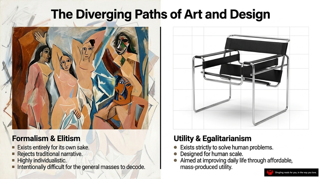
On the left, we see a chaotic, abstract painting representing the path of pure Art: Formalism and Elitism. As the slide explains, this path exists entirely for its own sake, rejecting traditional narratives to become highly individualistic. It intentionally makes itself difficult for the general masses to decode, prioritizing the artist's personal vision over any practical use.
Contrast that with the image on the right: the iconic Wassily Chair by Marcel Breuer. This represents the diverging path of Design: Utility and Egalitarianism. Here, form strictly follows function. These objects exist to solve human problems, designed specifically for human scale. The goal isn't to impress with complexity, but to improve daily life through affordable, mass-produced utility. While high-end art often remains an exclusive luxury for the wealthy, true design strives to bring beauty and function to everyone, making the modern world not just livable, but accessible.
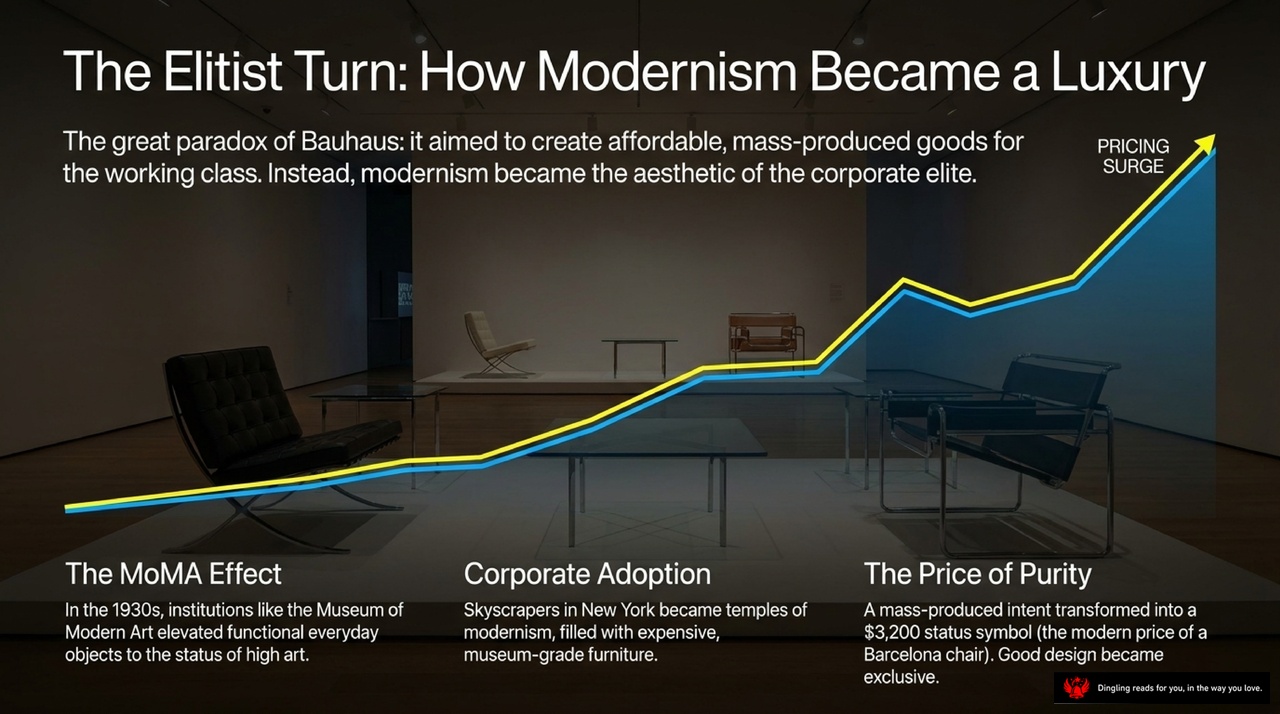
The Elitist Turn: How Modernism Became a Luxury. Look at this graph. It tells a shocking story about the very movement designed to liberate the working class. The Bauhaus started with a radical, democratic dream: affordable, mass-produced goods for everyone. But instead of staying in the hands of the people, modernism evolved into the exclusive aesthetic of the corporate elite.
See how the line climbs? This is the MoMA Effect. In the 1930s, institutions like the Museum of Modern Art elevated functional everyday objects to the status of high art. Once something was "museum-grade," its price tag skyrocketed. Then came Corporate Adoption. Skyscrapers in New York became temples of modernism, filled with expensive, museum-quality furniture that ordinary families simply couldn't afford.
The result is what we call The Price of Purity. A mass-produced intent transformed into a $3,200 status symbol. Take the Barcelona chair, for example. Originally designed to be a simple, functional seat for the public, it is now a luxury item costing thousands. Good design became exclusive. The great paradox of the Bauhaus is clear: it aimed to create accessible life, but the market turned its simplicity into a luxury we can only admire from afar.

By the 1970s, the sleek, serious glass boxes of modernism finally felt suffocating. Architects were tired of the rigid, cold aesthetic and craved something with real emotion, humor, and historical memory. Enter Robert Venturi, the catalyst who published *Complexity and Contradiction in Architecture*. He boldly praised the chaotic, vibrant landscape of Las Vegas over the sterile perfection of modernism, arguing that life is messy and architecture should be too. This shift became the antidote: architecture transformed into street theater. The new generation embraced irony, decoration, and complex contradictions over pure function. As the slide illustrates, buildings became playful, ironic, and visually rich, rejecting the idea that form must strictly follow function. Instead, they became works of art that delighted the senses, proving that a building could be both useful and wildly entertaining.

Design used to be about finding a single, universal truth—something timeless and functional. But look at what's happening now. We've shifted gears completely. As this slide illustrates, design has stopped chasing that perfect, unchanging ideal and instead started riding the waves of fashion and personal expression. It's a deliberate embrace of irony and ornament.
On the left, you see Michael Graves' iconic Alessi Teapot. It takes the strict, industrial geometry of modernism and grafts whimsical, historical details onto it. That red bird spout? That's postmodernism's playfulness colliding with modernism's stiffness. It's not trying to be serious; it's having fun.
On the right, we have the work of Philippe Starck. His objects are designed to look like sculptures first and tools second. Their primary purpose isn't just to function; it's to entertain and provoke. He breaks the old rule of "form follows function" and suggests something new: form follows fashion. These pieces are about the shifting currents of style, challenging us to see everyday objects not as utilitarian machines, but as personal statements. This is the era where design is allowed to be decorative, ironic, and undeniably human.

The Ideology Matrix: Two Eras of Design. Look at this split screen. On the left, we have Modernism, the cool, serious era defined by rectangles, grids, and pure function. Its goal was universal truth, drawing inspiration from factories and machines with a serious, utopian tone. It was all about order and logic. Now, flip to the right side: Postmodernism. This is the colorful, neon explosion of irony, emotion, and entertainment. Instead of rigid grids, we see curves and clashing colors. The inspiration shifts from industrial machines to history, pop culture, and the neon lights of Las Vegas. The tone? Playful, cynical, and deeply individualistic. It's a complete rejection of the "one right way" thinking of the past. While Modernism tried to strip away everything unnecessary to find a universal truth, Postmodernism embraced the messy, the historical, and the personal. It asks us to laugh at the rules we used to follow so strictly. So, is your design approach rooted in the functional clarity of the machine age, or does it embrace the chaotic, vibrant energy of the postmodern world?

Look at this chaotic tangle on the left, evolving into a single, smooth line on the right. This visual perfectly captures the core argument of "The Myth of Pure Rationality." We often think that great design is the result of a robotic, linear process, but the truth is quite different. True creativity actually starts with wild, messy exploration—like that scribble on the left—requiring lateral thinking and playful experimentation before it ever settles into a clean, functional form.
The slide breaks this down into two parts. Under "The Truth," we see that rational design doesn't mean abandoning human messiness; instead, strict rules are often applied *after* the fact to justify an intuitive leap. As the text explains, even pure functionalism begins with wild imagination. Under "The Justification," we see how the strict rules of Modernism are frequently used to rationalize a creative spark that was actually born from chaos. So, don't mistake the final, polished line for the entire journey. The magic happens in the messy, unstructured phase before the order ever arrives.

Today's best design has finally stopped fighting the war between form and function. Instead of choosing one over the other, it merges them into something entirely new. Look at this stunning structure: the Guggenheim Museum in Bilbao. Its twisting, metallic curves are pure emotion and sculpture, yet every line serves a purpose. This is the "Modern Compromise."
Designers now use high-tech, space-age software and highly functional engineering—core principles of Modernism—to create wildly emotional, non-rectangular buildings that feel like living sculptures, a hallmark of Postmodernism. We are seeing the best of both worlds. We still demand the mechanical utility and honesty of Modernism, but we also crave the emotional resonance and humanity that Postmodernism offers. This hybrid approach proves that great design doesn't have to be cold or purely decorative; it can be both useful and deeply moving.

Look at this stunning, glass-walled structure in the image. It represents a shift from the past, moving away from the ornate, symbolic styles of history toward something honest and functional. This visual perfectly captures the enduring legacy of the Bauhaus ideal.
While the strict, utopian rules of the Bauhaus were eventually shattered by postmodern rebellion, its foundational demand for utility, honesty, and purpose remains the bedrock of everything we build today. The image before you isn't just a building; it's a testament to the idea that design can create meaningful, functional order out of chaos.
As we design the digital and physical spaces of tomorrow, a critical question arises: Are we building monuments to our own egos, or are we finally delivering on the promise to make the world better for everyone? True design isn't about showing off; it's about serving human needs with clarity and integrity.