
Visual Hammer: Complete Chapter-by-Chapter Summary

Welcome to the world of the Visual Hammer. Imagine two hammers striking a nail, creating a burst of sparks that symbolizes the core idea of this book by Laura Ries: the ultimate guide to driving your verbal positioning into the consumer's mind using the emotional power of visuals.
In a crowded marketplace, your brand needs a way to break through the noise. The Visual Hammer is that tool. It's not just about looking good; it's about creating a unique, memorable visual element that acts as a magnet for your audience. Think of luxury brands like Porsche or Ferrari. You don't need to read the name to recognize them instantly. Their distinct designs—the curves, the badges, the colors—are their hammers, driving the concept of "premium performance" directly into your brain.
Without this visual anchor, your brand becomes invisible. Look at hybrid cars. The Prius dominates the market not just because of its technology, but because its unique shape instantly signals "eco-friendly" to anyone on the street. In contrast, other hybrids that look exactly like regular cars struggle to stand out. The Visual Hammer transforms an abstract idea into something tangible and desirable. It turns your brand from a commodity into a symbol, ensuring that when consumers think of a category, they see your specific visual signature first. This is the power of a well-crafted Visual Hammer.
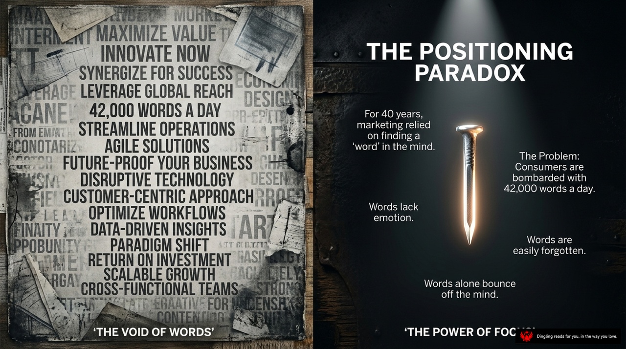
Today's slide highlights a critical trap we all face in marketing: "The Positioning Paradox."
On the left, you see a chaotic collage of buzzwords like "innovate now," "synergize," "disruptive technology," and "paradigm shift." This represents the modern noise. For 40 years, marketing has tried to win by finding a single word in the consumer's mind. But look at the right side of the screen. Here lies the problem: consumers are bombarded with 42,000 words a day. Words alone lack emotion, they are easily forgotten, and they simply bounce off the mind.
This is the paradox. We are drowning in language but starving for connection. Words cannot build a brand; they just create confusion. To break through this void, we need to stop relying on abstract concepts and start using visual anchors. Instead of trying to say more, we must show one powerful thing that sticks. This shift from a flood of words to a single, focused visual symbol is the only way to cut through the noise and actually land in the consumer's mind.

Imagine a nail without a hammer: it's just a piece of metal, useless and forgotten. Now picture a hammer with no nail: it's just a tool for decoration, lacking purpose. This is the core truth of market dominance.
Today, we are dissecting "The Anatomy of Market Dominance." Look at the diagram on your screen. We have two distinct parts. On the left, we have "The Verbal Nail." This represents your strategy and objective—the specific differentiating concept you want to own. It is the single word or phrase that defines your brand in the consumer's mind. Think of it as the target.
On the right, we see "The Visual Hammer." This is your execution and emotional vehicle. It is the tool that drives that nail into the consumer's mind. Without this hammer, your nail is useless. Without that nail, your hammer is just decoration.
Consider the visual power of a hammer versus a nail. A nail alone cannot penetrate a wall. But when you combine a clear verbal concept with a striking visual symbol, you create an unstoppable force. This is why brands like Porsche or Ferrari succeed; they don't just sell cars; they hammer a specific idea—speed, luxury, heritage—deep into your consciousness.
So, remember this: your strategy is the nail, but your visual identity is the hammer. You need both to build true market dominance.

Imagine your brain as a sophisticated machine with two distinct operating systems running simultaneously. On the left side, you have the logical processor—think of it as a complex engine of gears and circuits. This is the part that handles linear information, thinks in words, and critically evaluates facts. It's the skeptic in the room, constantly questioning and analyzing. But on the right side, you have the emotional engine. This side processes information in parallel, thinks in vibrant images, and instantly generates deep emotional resonance. It's the part that sees the big picture.
Now, here is the crucial insight: effective marketing isn't about convincing the left brain with facts alone. To truly change behavior, you must strike the right brain first. That's where the "Visual Hammer" comes in. When a powerful visual strikes the emotional right side, it commands the logical left side to accept the message. It's like a visual hammer hitting the emotional nail, forcing the skeptical brain to say, "Yes, this makes sense."
Look at the contrast in the image. On one side, we have cold, mechanical precision representing logic. On the other, we have fluid, fiery energy representing emotion. Brands that fail to activate this emotional side—like early electric cars that looked exactly like gas cars—get lost in the noise. Consumers don't just buy technology; they buy an identity. They want to feel something. A strong visual hammer bypasses the skepticism of the left brain and plants a seed of emotion in the right brain, making the brand unforgettable.

Imagine a blueprint for the ultimate brand weapon. At the center sits "The Visual Hammer Blueprint," a mechanical engine where four distinct gears drive your market dominance.
First, look at the top left: Aesthetics. It's not just about looking good; it's about the precise geometry of Shape and the psychological weight of Color. These aren't decorative choices; they are the first things a consumer notices before they read a single word.
Move to the top right for Tangibility. This is where the abstract becomes real. Your Product and its Packaging are the physical proof of your promise. Think of Heinz's iconic octagonal bottle or the unique shape of a vitamin water bottle—these aren't containers; they are the visual hook that stops a shopper in their tracks.
Now, look down to the bottom left: Humanity. This gear connects your brand to real people. It's about the Founder or the Celebrity who stands behind the logo. When a founder's image or a beloved celebrity becomes the face of the brand, like the Colonel for KFC or the founder of Jack Daniel's, you aren't just selling a product; you're selling a personality that people trust and remember.
Finally, the bottom right gear: Abstraction & Time. This is the most powerful lever. It includes Action, Animal, Symbol, and Heritage. Consider the dynamic motion of a car driving in an ad, the universal recognition of an animal like a jaguar or a cow, the timeless symbol of a red umbrella for insurance, or the heritage of an old-fashioned horse-drawn carriage that signals stability.
The magic happens when these four gears turn together. When you align your aesthetic shape, tangible packaging, human connection, and abstract symbols with a single, clear language anchor, you stop competing on features and start owning the category. You don't just build a brand; you install a permanent, unshakeable visual hammer in the consumer's mind.
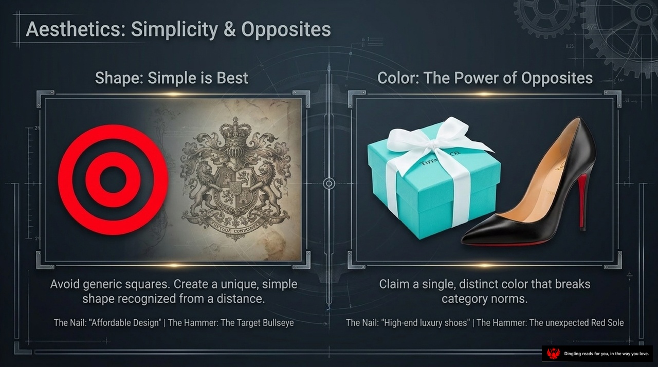
When we talk about aesthetics in branding, we often get stuck thinking it's just about making things look pretty. But the real magic happens when you master two powerful forces: simplicity in shape and the power of opposites in color.
Look at the left side of this slide. Under "Shape: Simple is Best," we see the Target bullseye and an intricate coat of arms. The lesson here is clear: avoid generic squares. Consumers need a unique, simple shape that they can recognize instantly from a distance. Think about the Target logo versus a complex crest; the simple circle cuts through the noise. It's not about complexity; it's about creating a visual anchor that sticks in the mind.
Now, shift your eyes to the right side, where it says "Color: The Power of Opposites." Here, we see the iconic Tiffany blue box and a black Christian Louboutin shoe with that famous red sole. The strategy here is to claim a single, distinct color that breaks category norms. Tiffany didn't use the standard white for jewelry; they chose a specific blue that became synonymous with luxury. Similarly, the Louboutin shoe is black, which is normal for high heels, but that unexpected red sole makes it instantly recognizable.
In a crowded marketplace, these choices are your superpowers. A simple shape grabs attention before a word is read, while a bold, unexpected color tells a story without saying a thing. It's about standing out by being simple and being different.

Tangibility: The Perfect Vehicle. Look at this slide, and you'll see the core strategy for making intangible product features feel real to the consumer.
First, notice the top section: "The Product as the Hammer." The text here highlights the Toyota Prius. It's a perfect example of embedding a visual differentiator directly into the product itself. The Prius doesn't just act like a hybrid; its unique silhouette physically looks like one. That aerodynamic efficiency and hybrid synergy drive aren't just specs on a spec sheet; they are visible. The car's shape tells the consumer, "I am an eco-friendly vehicle," before they even read a single word. This is the power of designing the visual cue right into the vehicle's DNA.
Now, look at the bottom section: "Packaging as the Hammer." This features Absolut Vodka. The text explains that if the product itself can't look different, the packaging must. As a latecomer in the vodka market, Absolut couldn't change the liquid inside, so it created an iconic apothecary bottle. That specific shape drove the nail of "premium pricing" into the consumer's mind instantly. It transformed a generic bottle into a recognizable symbol of quality and design.
The lesson here is clear: whether it's the unique silhouette of a Prius or the distinct bottle shape of Absolut, tangibility turns abstract concepts into concrete reality. When a product or its packaging becomes a visual hammer, it stops competing on features and starts competing on identity. That is how you build a perfect vehicle in the customer's mind.
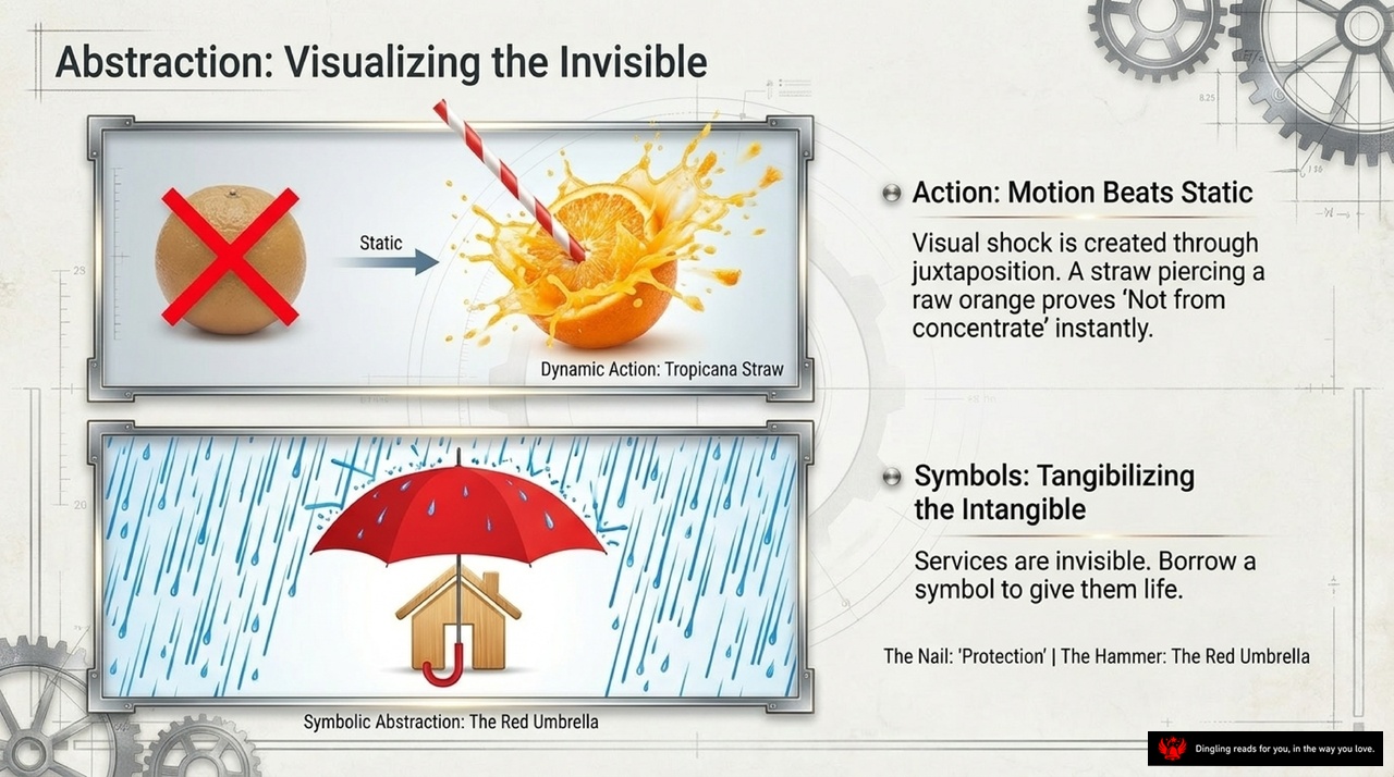
Abstraction is all about making the invisible visible, and this slide breaks it down into two powerful strategies: using motion and using symbols. Look at the top example here. On the left, we have a static orange with a red cross, representing nothing. But on the right, we see a straw piercing a raw orange with juice splashing everywhere. This dynamic action creates an instant visual shock. It proves the message "Not from concentrate" without needing a single word. Motion beats static every time because it captures attention and conveys truth instantly.
Now, look at the bottom image. Services are often intangible and hard to sell, but we can tangibilize them using symbols. Here, a red umbrella protects a house from the rain. This simple symbol transforms the abstract concept of "protection" into something you can see and feel. Whether it's an umbrella for safety or a straw for freshness, the key is to borrow a symbol that gives life to your invisible value. By combining dynamic action with meaningful symbols, you turn abstract ideas into concrete realities that consumers can instantly understand and trust.
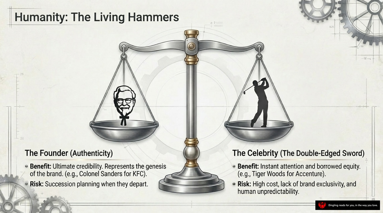
Holding the scales of branding, we see a pivotal choice: do you anchor your identity in the Founder, or do you lean on the Celebrity? The slide perfectly captures this tension. On the left, we have the Founder, representing Authenticity. Think of Colonel Sanders for KFC. His power lies in ultimate credibility; he is the genesis of the brand, the living proof of its promise. However, this comes with a significant risk: succession planning. What happens to the brand's soul when that iconic figure eventually departs?
On the right, we see the Celebrity, often called the Double-Edged Sword. Here, the benefit is instant attention and borrowed equity. A star like Tiger Woods can instantly elevate a brand like Accenture, lending them a level of prestige they might take decades to build on their own. But the risks are just as sharp. Celebrities demand high costs, offer no true brand exclusivity, and introduce the element of human unpredictability. A scandal can destroy the brand overnight.
So, which side of the scale is heavier? It depends on your strategy. If you prioritize long-term trust and storytelling, the Founder is your best bet. If you need a quick spike in relevance and are willing to manage the volatility of fame, the Celebrity might be your lever. But remember, neither is a magic bullet; both require careful management to ensure they truly serve your brand's core value rather than overshadowing it.

Humans naturally project personality onto animals, making them perfect tools for bringing a brand to life. This is the power of Fauna: using a specific, memorable creature to bypass logical resistance and create an instant emotional connection.
Look at these three examples. On the left, the polo player on horseback drives the nail of "high-end luxury," instantly communicating exclusivity and tradition. In the middle, a friendly green lizard transforms a boring car insurance product into something approachable and trustworthy. And on the right, a simple duck takes an unpronounceable acronym and turns it into a household name.
By picking one specific animal, you give your brand a face and a character. It stops the consumer from analyzing features and starts them feeling a relationship. This is how you personify your brand and make it unforgettable.
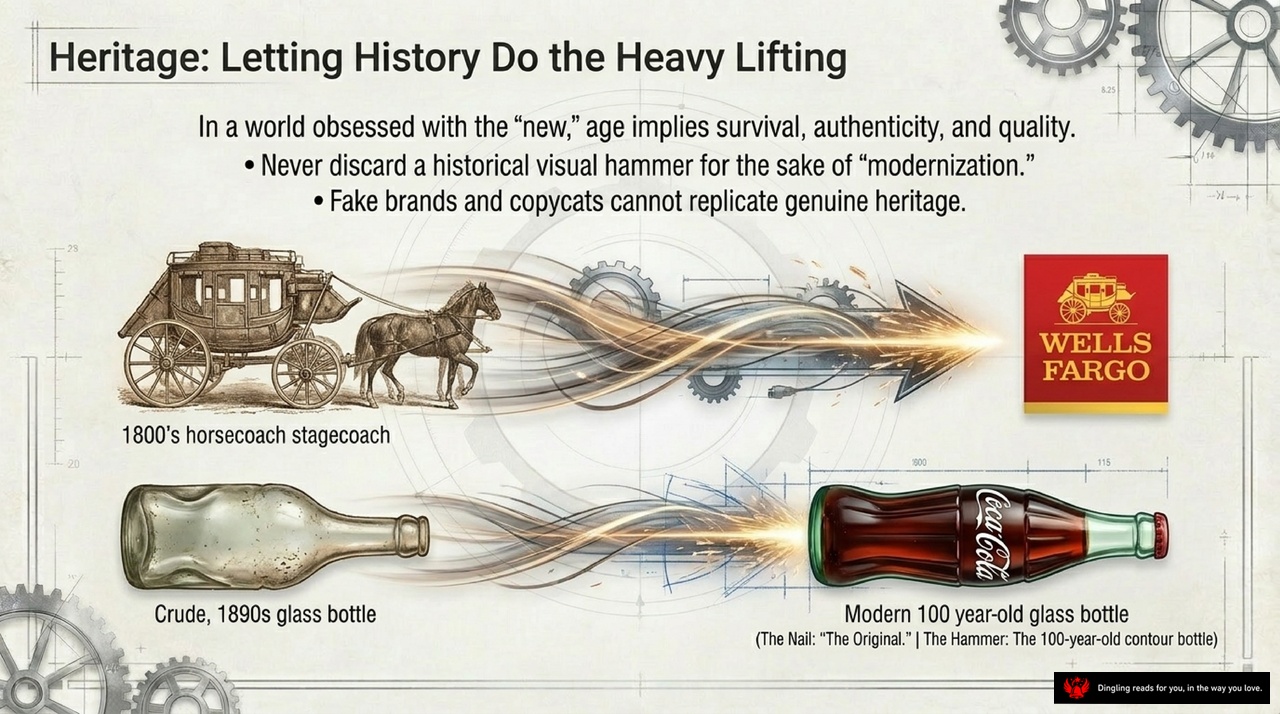
In a world obsessed with the "new," we often forget that age implies survival, authenticity, and quality. True heritage isn't about looking old; it's about letting history do the heavy lifting for you. Look at these two powerful examples: the Wells Fargo stagecoach and the iconic Coca-Cola contour bottle.
Notice how the Wells Fargo logo features a horse-drawn carriage from the 1800s. That isn't just a drawing; it's a declaration that their roots are deep and reliable. Similarly, look at the evolution of the glass bottle. We moved from a crude, generic 1890s bottle to the modern, 100-year-old Coca-Cola shape. That specific curve is the "Original." It's the hammer that drives the nail of "authenticity" into the consumer's mind.
Here is the hard truth: fake brands and copycats can mimic your product, but they can never replicate genuine heritage. They can't manufacture a century of trust or the emotional weight of a history that spans generations. When you preserve these historical visual elements, you tell a story that no amount of modern marketing spend can buy. Your brand becomes a living legacy, not just another item on a shelf.
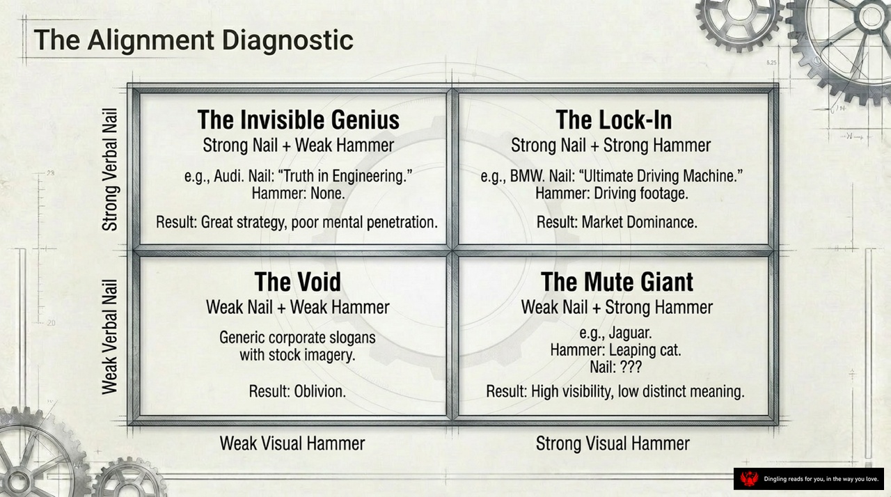
Today, let's break down the "Alignment Diagnostic," a powerful framework for understanding why some brands dominate while others fade into obscurity. As you see on the screen, this model maps the relationship between a brand's verbal "Nail"—its core promise—and its visual "Hammer"—its distinctive symbol.
In the top right, we have "The Lock-In." This is the sweet spot where a strong Nail meets a strong Hammer. Think BMW: their Nail is "Ultimate Driving Machine," and their Hammer is those iconic driving footage ads. This alignment creates market dominance. Contrast this with Audi, which sits in the top left as "The Invisible Genius." They have a strong Nail—"Truth in Engineering"—but a weak Hammer, meaning no distinctive visual symbol. The result? Great strategy, but poor mental penetration.
Now look at the bottom right: "The Mute Giant." Here, a brand has a strong visual Hammer but a weak verbal Nail. Jaguar is the perfect example. Their leaping cat is instantly recognizable, yet they lack a clear, specific positioning statement. They get high visibility but low distinct meaning. Finally, in the bottom left, we have "The Void." This is the danger zone where both the Nail and Hammer are weak. Generic corporate slogans paired with stock imagery lead to nothing but oblivion.
The lesson is clear: to truly own a category, you need both. Your message must be sharp, and your visual symbol must be unique. Without this alignment, even the most beautiful design or the smartest strategy will fail to take root in the consumer's mind.
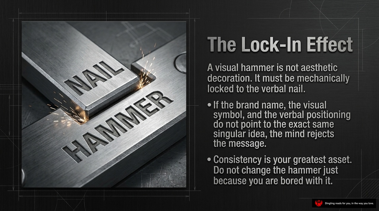
The Lock-In Effect: A visual hammer isn't just for show; it has to mechanically lock onto the verbal nail. If your brand name, your visual symbol, and your positioning don't all point to the exact same singular idea, the human mind simply rejects the message. Think of it like a tool: a hammer is useless if it's not attached to a nail. Consistency is your greatest asset here. Do not change the hammer just because you're bored with it. Whether it's Porsche's headlights or a specific color like Tiffany Blue, the visual and the verbal must be fused. When they align perfectly, you stop selling a product and start owning a concept in the consumer's mind.
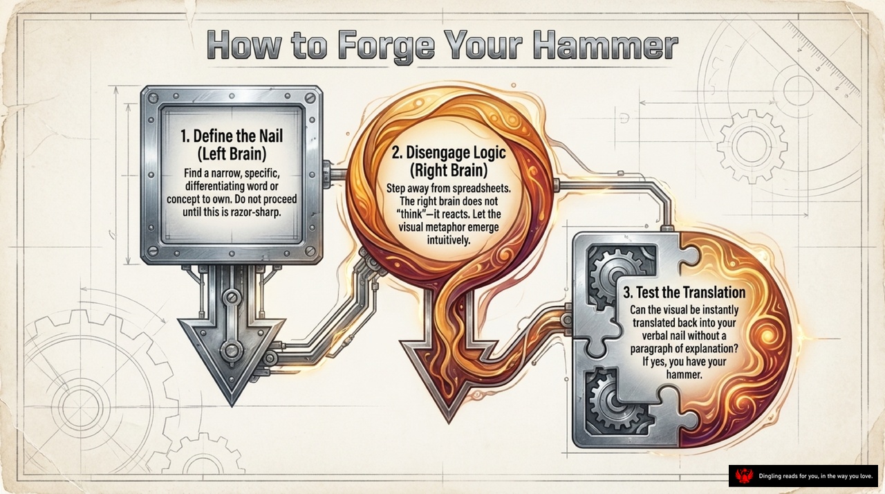
How to Forge Your Hammer
Let's talk about the three-step process for building an unshakeable brand. Think of it as a blueprint for creating a "Hammer"—a visual symbol that drives your message home.
First, define the nail. This is your specific, differentiating concept. You need to find that one razor-sharp word or idea that owns a category in the consumer's mind. Don't move forward until this nail is perfectly honed.
Once you have your nail, step two: disengage logic. Put away your spreadsheets and let your right brain take over. The right brain doesn't think; it reacts. It needs to generate a visual metaphor intuitively, something that feels natural and emotional rather than calculated.
Finally, test the translation. Ask yourself: Can this visual be instantly translated back into your verbal nail without needing a paragraph of explanation? If the answer is yes, you have successfully forged your hammer. It's not just a logo; it's a direct, undeniable connection between your core idea and the consumer's mind.

Marketing isn't just about what you say; it's about the battle for perception fought entirely in the mind. While words define your strategic objective, visuals are your tactical weapon. True brand dominance happens only when you unify a sharp verbal concept—the "Nail"—with an emotionally resonant, instantly recognizable image, which we call the "Visual Hammer."
Look at your own brand today. Are you trying to drive your nail with a piece of paper, or do you actually have a hammer?
Consider the difference between Toyota's Prius and Honda's Civic Hybrid. The Prius dominates the market not just because it's efficient, but because its unique shape acts as a powerful visual hammer. It makes the technology visible and the eco-friendly attitude undeniable. In contrast, the Civic Hybrid looks just like a regular sedan; without a distinct visual signature, it struggles to capture attention, regardless of its performance.
Or look at the luxury world. Rolls-Royce sells far fewer cars than many competitors, yet its iconic grille makes it instantly recognizable as the pinnacle of luxury. Meanwhile, Mazda sells hundreds of thousands of vehicles annually, yet many people can't even identify their specific models on the road because they lack a unique visual anchor.
The lesson is clear: your brand needs a hammer that fits your nail perfectly. Without that distinct visual identity, you risk being invisible in a crowded marketplace.